


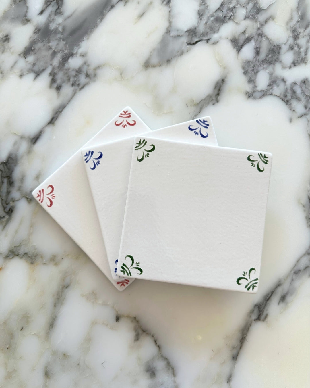
Compare our colours
| Feature | Dutch Blue | Potters Green | New England Red |
|---|---|---|---|
| Colour | |||
| Collective Effect | Rich, bright and complex, — a nod to classic Delftware. | Calming yet grounded — a refined, natural tone. | Joyful, warm and confident. |
| Undertone | True blue with subtle charcoal depth. | Cool, muted green with a soft blue-grey cast. | Warm red with subtle burgundy undertones. |
| Depth | Deep | Medium | Medium- deep |
| Notes | Has a layered sense of depth and movement, which beautifully shows off the hand-drawn qualities of our tiles. | To potter around in the garden, to pick wildflowers, to lie in the grass in the sun - potters green is a celebration of the simple things. | This red is an homage to all things about New England and the beauty of its fall foliage. |